Navigation
Mahresources uses a top navigation bar, sidebar filters, and keyboard shortcuts across all pages.
Top Navigation Bar
The navigation bar appears at the top of every page.
Desktop View
On larger screens, the navigation displays as a two-tier horizontal menu:
Main menu links:
- Dashboard - Overview and recent activity
- Notes - Text notes and documentation
- Resources - File uploads and management
- Tags - Labels for categorization
- Groups - Hierarchical organization
- MRQL - MRQL query language interface
Admin dropdown (click to expand):
- Overview - Admin dashboard
- Queries - Saved database queries
- Categories - Group type definitions
- Resource Categories - Resource classification types
- Relations - Group-to-group relationships
- Relation Types - Relationship type definitions
- Note Types - Note type definitions
- Logs - System activity log viewer
Plugins dropdown (appears when plugins are enabled):
- Manage Plugins - Plugin enable/disable and settings
- Plugin-registered menu items appear here
The currently active section is highlighted in bold. If the current page belongs to the Admin dropdown, the dropdown button is also highlighted.
Mobile View
On smaller screens, the navigation collapses into a hamburger menu. Tap the menu icon to reveal a dropdown list of all sections.
Settings
The gear icon in the top-right corner opens a settings dropdown with display preferences:
- Show Descriptions - Toggle whether entity descriptions appear in list views
Global Search
Open the search dialog by clicking Search in the header or pressing Cmd+K (macOS) / Ctrl+K (Windows/Linux).
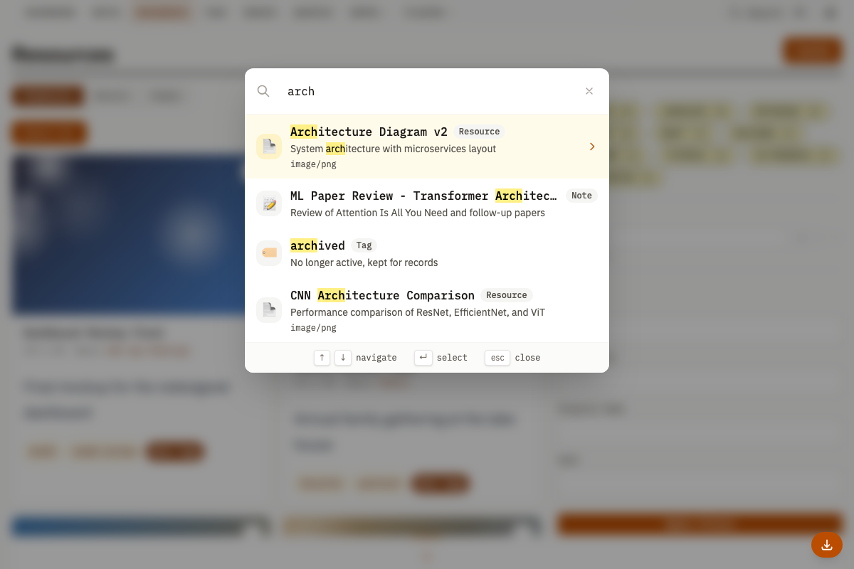
Type at least 2 characters. Results appear as a flat list ranked by relevance, each showing a type badge (Resource, Note, Group, Tag, etc.), the item name, and a description preview.
Keyboard Navigation
| Key | Action |
|---|---|
| Arrow Up/Down | Move through results |
| Enter | Open selected result |
| Escape | Close search dialog |
Results are cached server-side for 60 seconds. The default result limit is 20 (server max: 50). The frontend requests 15 by default.
List Views
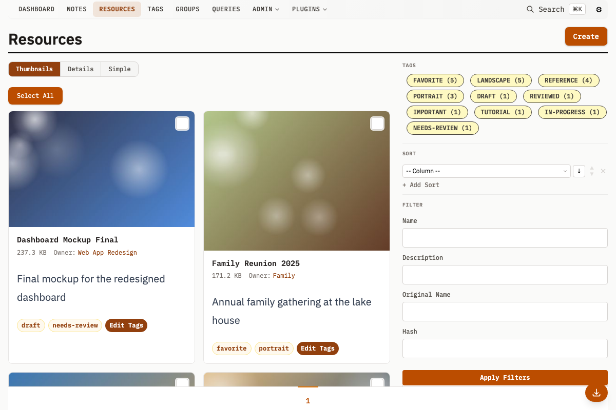
Table Layout
Most list views use a table showing:
- Checkbox for bulk selection
- Entity ID
- Name (links to detail page)
- Preview thumbnail (for resources)
- Timestamps (created, updated)
- Entity-specific columns
Display Options
List views offer alternative display modes. Use the selector at the top of the list to switch between them.
Resources:
- Thumbnails (default) - Card grid with thumbnail previews
- Details - Full table with all columns
- Simple - Compact list with essential information
- Timeline - Chronological timeline view
Groups:
- List (default) - Standard list view
- Text - Text-focused view
- Tree - Hierarchical tree visualization
- Timeline - Chronological timeline view
Sidebar Filters
The sidebar on list pages contains filter controls:
- Popular Tags - Quick-filter buttons for frequently-used tags
- Sort Options - Multi-column sort builder (see below)
- Text Filters - Search within name, description, etc.
- Autocomplete Filters - Filter by tags, groups, or owner
- Date Filters - Filter by creation or modification date
- Dimension Filters - Filter images by width/height (resources only)
Click Search to apply. The URL updates to reflect your filters, so you can bookmark or share filtered views.
Multi-Sort Builder
The sort options section in the sidebar contains a multi-column sort builder:
- Click + Add Sort to add a sort criterion
- Select a column from the dropdown (available columns depend on the entity type)
- Choose ascending or descending direction
- Add more criteria -- the first criterion is primary; subsequent criteria break ties
- Reorder criteria with the up/down arrows
- Remove criteria with the remove button
Sort by metadata values by selecting the metadata column and entering a JSON key name (e.g., priority). The sort builder initializes from URL query parameters, so bookmarked sorted views restore the sort criteria on page load.
Pagination
When results exceed a single page, pagination controls appear at the bottom:
- Previous/Next arrows for sequential navigation
- Page numbers for direct access to specific pages
- Current page is highlighted
Detail Views
Page Header
Every detail page includes:
- Breadcrumb - Navigate back to the list view
- Entity Name - Inline editable by clicking (changes save automatically)
- Action Buttons - Edit, Delete, or entity-specific actions
- Timestamps - Created and Updated dates in the sidebar
Main Content Area
- Description - Full text, with expandable sections for long content
- Related Entities - Connected items (notes on a resource, resources in a group, etc.)
- Entity-Specific Data - Metadata, file info, or type-specific content
Sidebar
- Owner - The group that owns this entity
- Tags - Assigned tags (inline editable)
- Metadata - Custom key-value pairs
- Quick Actions - Entity-specific operations
Related Entity Sections
Related entities appear in expandable sections:
- Own Entities (for groups) - Items directly owned by this group
- Related Entities (for groups) - Items associated but not owned
- Relations - Custom typed relationships to other groups
Each section includes:
- A count of related items
- Thumbnails or previews where applicable
- A link to view all related items
- A quick-add button to create new related items
Responsive Design
- Desktop (1024px+) - Full layout with sidebar filters and detailed tables
- Tablet (768-1024px) - Condensed navigation, scrollable tables
- Mobile (under 768px) - Hamburger menu, stacked layouts, simplified views
Keyboard Shortcuts
Global
| Shortcut | Context | Action |
|---|---|---|
| Cmd/Ctrl + K | Any page | Open/close global search |
| Cmd/Ctrl + Shift + D | Any page | Toggle Download Cockpit |
| Cmd/Ctrl + V | Any page with upload context | Open paste upload modal (requires group/note detail page, or list filtered by owner) |
| Escape | Any page | Close dialogs, dropdowns, modals, and inline editors |
Global Search
| Shortcut | Action |
|---|---|
| Arrow Up / Arrow Down | Move through results |
| Enter | Open selected result |
| Escape | Close search dialog |
List Views (Bulk Selection)
| Shortcut | Action |
|---|---|
| Click checkbox | Toggle single item selection |
| Shift + Click | Select range from last-clicked to current item |
| Right-click | Range select/deselect from last-selected to right-clicked item |
| Space | Toggle selection on items within a text selection range |
| Shift + Submit (on delete) | Bypass the confirmation dialog |
Lightbox
| Shortcut | Action |
|---|---|
| Arrow Left / Arrow Right | Previous/next image |
| Page Up / Page Down | Previous/next image |
| Enter | Toggle fullscreen |
| E or F2 | Toggle info panel |
| T | Toggle quick tag panel |
| Double-click | Toggle native resolution zoom |
| Ctrl + Scroll | Zoom toward cursor position |
| 1-9 | Toggle tag slot on active tab (requires quick tag panel open) |
| Z / X / C / V / B | Switch to QUICK 1 / QUICK 2 / QUICK 3 / QUICK 4 / RECENT tab (requires quick tag panel open) |
| 0 | Focus tag editor |
| Escape | Close lightbox |
@-Mention Autocomplete
Type @ in description textareas (on note, group, and resource create/edit forms) to search and link entities. See Mentions.
Autocomplete Dropdowns
| Shortcut | Action |
|---|---|
| Arrow Up / Arrow Down | Navigate suggestions |
| Enter | Select highlighted item |
| Tab | Close dropdown and advance to next field |
| Escape | Close dropdown |
Inline Editing
| Shortcut | Action |
|---|---|
| Enter | Save changes (single-line fields) |
| Escape | Cancel and revert |
Lightbox
Click any image or media preview to open the lightbox viewer.
- Navigate - Arrow keys, swipe, or drag between images. The lightbox loads additional pages of results automatically as you browse.
- Zoom - Scroll wheel or pinch to zoom. Double-click to toggle native resolution.
- Zoom Presets - Click the zoom percentage indicator for presets (Fit, Stretch, 25%-500%) calculated from the image's native resolution.
- Pan - Drag or swipe to move around a zoomed image.
- Info Panel - View resource details (size, dimensions, type, timestamps, owner, category, counts, hash, and more) in a side panel without leaving the lightbox. Name and description are inline editable directly in the panel.
- Video - Play video files directly in the viewer.
- Fullscreen - Enter fullscreen mode to hide all other UI.
- Touch - Pinch-to-zoom, swipe to navigate, two-finger pan.
- Close - Press Escape or click outside the image.
Quick Tag Panel
The Quick Tag Panel is a side panel in the lightbox for rapid tag assignment while browsing images.
The panel has five tabs:
| Tab | Key | Behavior |
|---|---|---|
| QUICK 1 | Z | 9 manually assigned tag slots |
| QUICK 2 | X | 9 manually assigned tag slots |
| QUICK 3 | C | 9 manually assigned tag slots |
| QUICK 4 | V | 9 manually assigned tag slots |
| RECENT | B | Auto-populated with the 9 most recently used tags |
Total configurable capacity: 36 slots across the four QUICK tabs.
Setup:
- Open the lightbox on any image
- Open the Quick Tag Panel via its toggle button
- On a QUICK tab, assign tags to the 9 slots -- each maps to a number key (1-9)
- Slot assignments persist in localStorage across sessions
Usage:
- Press Z/X/C/V to switch QUICK tabs, B for RECENT
- Press 1 through 9 to toggle the tag in that slot on the active tab
- Click a tag slot button to toggle the tag
- Tags are applied or removed immediately via API calls
- Browse to the next image with arrow keys and continue tagging