Managing Notes
Create, edit, and organize text content with date ranges, block-based editing, metadata, and type-specific templates.
Creating Notes
Basic Note Creation
- Navigate to Notes in the top menu
- Click the Create button
- Fill in the note fields:
- Title - The note's display name (required)
- Text - The main content of the note. Type
@to mention and link to resources, groups, or tags (see Mentions) - Start Date - Optional start date/time
- End Date - Optional end date/time
- Click Save
Adding Relationships
When creating or editing a note, you can link it to other entities:
- Tags - Labels for categorization and filtering
- Groups - Associate with one or more groups
- Owner - Set the group that owns this note
- Note Type - Apply a note type for custom formatting
From a Group
Create notes directly owned by a group:
- Navigate to a group's detail page
- In the Own Entities section, find Notes
- Click Add New
- The owner is pre-filled with the current group
Viewing Notes
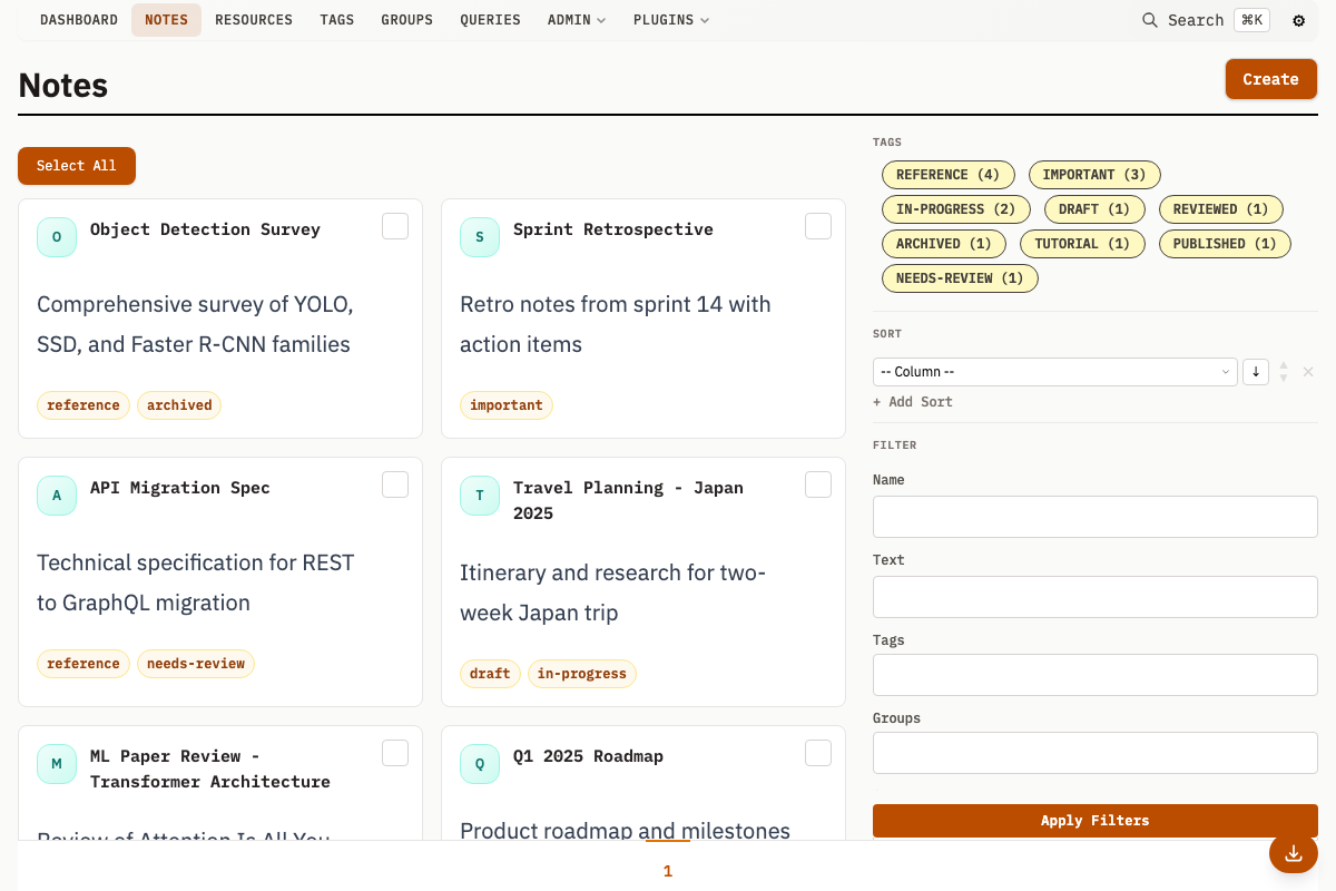
Notes List
The notes list displays cards for each note, showing:
- Checkbox - For bulk selection
- Avatar - Note type custom avatar or default initial
- Title - Note name (click to view details)
- Description - Text preview (truncated)
- Tags - Assigned tags
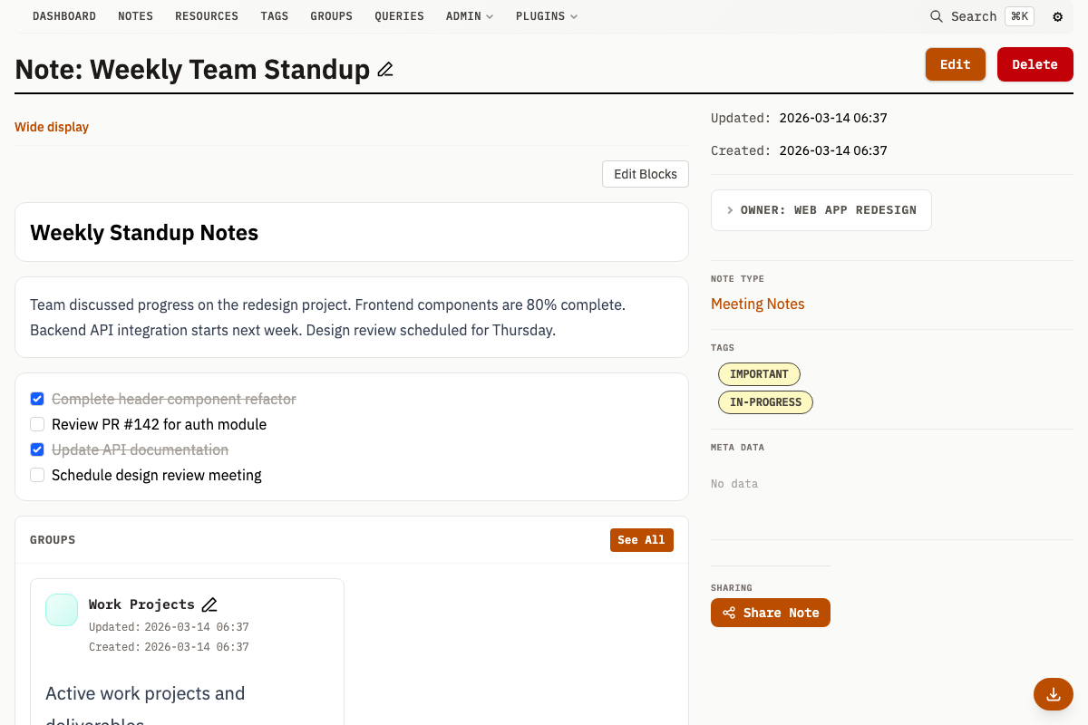
Note Detail Page
The detail page shows:
Header
- Note title (inline editable)
- Edit and Delete buttons
Main Content
- Note type custom header (if configured)
- Start/End dates (if set), shown in a meta strip
- Wide display link for full-screen reading
- Full text content with formatting preserved
- Block editor (if blocks exist)
- Related groups
- Attached resources
Sidebar
- Note type custom sidebar (if configured)
- Owner group
- Note type link
- Tags
- Custom metadata
- Sharing controls (if sharing is enabled)
Editing Notes
- Click Edit on any note detail page
- Modify fields as needed
- Click Save
Inline Title Editing
Click the note title in the header to edit it directly. Changes save automatically.
Note Types
Note types add custom templates and styling to notes.
Note Type Properties
| Property | Description |
|---|---|
name | Identifier for the type |
description | Description of the note type |
customHeader | HTML template displayed above Note content |
customSidebar | HTML template displayed in the sidebar |
customSummary | HTML template for list views |
customAvatar | HTML template for Note avatars |
Using Note Types
- Create a note type in Note Types > Add
- Define the name and optional custom HTML
- When creating/editing notes, select the type from the Note Type field
Custom Templates
Note type templates are rendered server-side using Pongo2 (Django-like syntax). The note variable holds all note fields:
<h2>{{ note.Name }}</h2>
<p>{{ note.Description }}</p>
Templates also have access to Alpine.js for client-side interactivity via the entity JavaScript object:
<div x-data>
  <span x-text="entity.Meta.status"></span>
</div>
Creating a Note Type
- Navigate to Note Types in the menu
- Click Add
- Enter a name
- Optionally add:
- Description - Description of the note type
- Custom Header - HTML displayed above note content
- Custom Sidebar - HTML displayed in the sidebar
- Custom Summary - HTML for list views
- Custom Avatar - HTML for note avatars
- Click Save
Wide Display Mode
Wide display mode shows the Note text in a full-width prose layout:
- Navigate to a note detail page
- Click Wide display link below the title
- The note content displays in a full-width layout
Attaching Resources
Link resources (files) to notes for reference:
From Note Detail
- Navigate to the note detail page
- In the Resources section, click Add New
- Upload or import a new resource
- The resource is automatically linked to the note
From Resource Creation
- When creating a new resource
- In the Notes field, search for and select notes
- The resource is linked to selected notes
Viewing Attached Resources
Attached resources appear in the Resources section of the note detail page:
- Thumbnail previews (for images)
- Click to view resource details
- Click thumbnail to open in lightbox
Date Ranges
Notes support optional date ranges useful for:
- Event documentation
- Time-bounded information
- Historical records
Setting Dates
- In the note create/edit form
- Find the Start Date and End Date fields
- Use the datetime picker to select dates
- Both fields are optional and independent
Date Display
When set, dates appear in the meta strip above the note content:
- Started: [date]
- Ended: [date]
Note Metadata
Custom Metadata
Add key-value pairs using the Meta Data section:
- Enter a key name
- Enter a value
- Click + for additional fields
- Save the note
Metadata Keys
Existing keys from other notes appear as autocomplete suggestions.
Deleting Notes
Single Note
- Navigate to the note detail page
- Click Delete in the header
- Confirm deletion
Bulk Deletion
From the notes list:
- Select multiple notes using checkboxes
- Use the bulk delete operation
Note deletion is permanent. Related resources are not deleted but the link to them is removed.
Using the Block Editor
The block editor appears below the main content area on note detail pages. It lets you organize note content using different block types.
Entering and Exiting Edit Mode
- Click the Edit Blocks button in the top-right corner of the block editor to enter edit mode
- The button changes to Done when in edit mode
- Click Done to exit edit mode and return to view mode
- Changes to block content are saved automatically when you click away from a field
Block Types
The block editor supports eight built-in block types. Plugins can register additional types.
| Block Type | Description |
|---|---|
| Text | Rich text content |
| Heading | Section heading (H1-H6) |
| Divider | Horizontal separator line |
| Gallery | Resource thumbnails in a grid layout |
| References | Linked group cards |
| Todos | Checklist with interactive checkboxes |
| Table | Data table (manual data or driven by a saved Query) |
| Calendar | Calendar view from iCal sources or custom events |
Adding Blocks
- Enter edit mode by clicking Edit Blocks
- Click the + Add Block button at the bottom of the block list
- Select a block type from the dropdown menu
- The new block appears at the end of the list
Editing Block Content
Each block type has its own editing interface:
Text blocks: A textarea appears for entering Markdown-formatted text.
Heading blocks: A dropdown to select the heading level (H1-H6) and a text input for the heading text.
Divider blocks: No content to edit - displays as a horizontal line.
Gallery blocks: Click the add button to open the entity picker, then browse or search for resources to include. Selected resources display as thumbnails.
References blocks: Click the add button to open the entity picker, then browse or search for groups to reference. Selected groups display as linked cards.
Todos blocks:
- Edit item labels in text inputs
- Click + Add item to add new todo items
- Click the x button to remove items
Table blocks:
- Add/remove columns with labels
- Add/remove rows with values for each column
- Click + Add column or + Add row to expand the table
Reordering Blocks
In edit mode, each block displays control buttons in its header:
- Click the up arrow to move the block up one position
- Click the down arrow to move the block down one position
- The up arrow is disabled for the first block
- The down arrow is disabled for the last block
Deleting Blocks
- Enter edit mode
- Click the trash icon on the block you want to delete
- Confirm the deletion in the dialog that appears
Block deletion is immediate and cannot be undone.
Interactive Features (View Mode)
Some blocks have interactive features available in view mode:
Todos: Click checkboxes to mark items as complete or incomplete. Completed items show strikethrough text. Checkbox state is saved automatically.
Tables: Click column headers to sort the table by that column. Click again to toggle between ascending and descending order. Sort state is preserved during your session.
Gallery: Click thumbnails to open the lightbox viewer.
References: Click group links to navigate to the group detail page.
Description Field Synchronization
The note's Description field (shown in the main content area and note lists) automatically stays synchronized with the first text block in the block editor:
- When you edit the first text block, the Description field updates to match
- When you create a new text block and it becomes the first one, its content becomes the Description
- If you delete the first text block, the next text block's content becomes the Description
- This ensures backward compatibility with notes that do not use the block editor
Notes in Context
Notes appear in several contexts:
On Resource Pages
Resources show their linked notes in the Notes section, providing context and documentation for files.
In Groups
Groups can own notes (in Own Entities) or be related to notes. Owned notes typically document the group itself, while related notes provide cross-references.
Search Results
Notes appear in global search results, searchable by title and text content.